Tuesday, June 2, 2009

Trish's Travels ...

Trish sent me some photos from some recent travelling ...

"This was taken just north of Pt Augusta on my recent trip to Marla. "


I think this is a classic photo ;-) ... only in Australia. I grew up on a station northwest of Woomera and they didn't have those signs back then!!

"This is "travelling" home from Coffins from a night shift. This is a sunrise at Edilillie."


Beautiful Trish ... very serene.

Thank you for your photos.

Sue's - 'She' challenge

When i first read this i thought, oh wow....that's too hard for me! And while i was out walking the old brain cogs got going!

I knew which photo i wanted to use....one of my Nanna Proctor many years ago....enjoying a cuppa tea at some supper dance. I love this photo of her. Just which quote to pick was probably the most difficult....so many suited this grand lady.

I have been wanting to use my new Tim Holtz bird/ branch stamp, these new October Afternoon papers that i purchased at Lock shop on Saturday, plus cut some card in a semi circle........and before i knew it, the page had come together.

Challenge completeo!

Ali E's tip of the day

13. You can never go wrong with circle or square punches.

I have been experimenting a bit of late myself with round-ness on my pages... and do you know what? I am loving the effect.

Marika - she


*insert bulging eyes*
O.M.G. Marika. This is GREAT. love love love love the blue paint, the combo ofpapers and that clear dymo. Your photo is incredible - what a great shot! And oh my goodness i just love how that quote gives me goosebumps on that page - so beautiful.
and is this a smaller size i see too? Great work - good on you for experimenting size wise. You are total proof that bigger isn't always better and that great things come in small packages. We have been telling our men that for ages so now we need to believe it ourselves LOL.

Tiff - she


oh wow this one is amazing Tiff. Really lovely.


Tiff says:


the Prima Petite Fleur vine just sets this one off perfectly. Great timing for these quotes as I have a number of Annie photos coming up that they will suit perfectly. So you may see a few from me this month. ;-P I put in an extra pic so you could see the 'watermark' print of the quote. Very very subtle in real life. Amanda Hall
Photography ;-D


that prima vine is perfect there Tiff. Lovely use of that quote.


Maryanne - photo challenges

Maryanne has sent me two images for last month's looking down photo challenge. She asked me to decide which one i liked better but i couldn't either. LOVE the vicious look of this first one


and the crispness of the photo in this next one -

Maryanne says :

this is our[sort of] cat lucky.Scruff rescued him from one of the cells at the yeelanna silos around 7 years ago.Hes never really become domesticated,still a little feral, and actually went missing for a couple of years but turned up again around a year ago!!

Fabulous- love these!

and i almost fell off my chair when i saw this next one for the current theme of TRAVEL.

Maryanne says:

And heres something for the travel challenge....very appropriate for me as I will be going to nsw in 3 weeks time and have been getting a little concerned about travelling with all this swine flu about.Have even been considering one of these....but maybe not..

classic shots Maryanne. Funny fish!

Monday, June 1, 2009

Ali E's tip of the day

12. Just stick it down. If you have been looking at a single layout for days and days and days it is probably time to just stick it all down and move on the next. Isn't it awesome that there is always another story to tell?

again i think i may have to frame this one and sing it like a monk's mantra 'stick it down, just stick it down'

Trish's gift

"Just a little project I have finished for an 80th birthday pressy. Its for a lady Mum and I stayed with in Port Augusta on our way to Marla recently. We both were given a cup of tea (saucer included) in bed each morning,ohhh bliss. I know it doesn't fit a challenge but someone suggested rather strongly that I should send it in LOL. Any guesses who?
Cheers Trish S."

Wow Trish ... love those bling embellishments and the flowers with the brad centre!! I am sure the lady will love your gift! An amazing lady by the sound of it too!

Sunday, May 31, 2009

Hello June

Welcome to June and here is a whole bunch of new challenges we hope will inspire you to create!


Sue's Sketch for June

Sue says -

Here's my sketch challenge for June. I have distressed the edges of the papers, added various embellishments and even some rubons up along the side - which aren't part of the sketch..... so have fun and i look forward to seeing what you all come up with.


Amanda's Challenge


Ok well my challenge is to make a layout but incorperate a quote..........some very specific quotes actually. Don't worry - there is a LOT you can choose from. Just choose one and let the quote inspire you.


These quotes are from a great empowering book by Kobi Yamada.


{She} ...by Kobi Yamada


  • She must be something special. She is. Celebrate her.


  • She loved life and it loved her back. Celebrate her passion.


  • She listened to her heart above all other voices. Celebrate her wisdom.


  • She pursued big dreams instead of small realities. Celebrate her priorities.


  • She saw every ending as a new beginning. Celebrate her resiliency.


  • She discovered her real measurements had nothing to do with numbers or statistics. Celebrate her self-esteem.


  • She was kind, loving and patient…with herself. Celebrate her tenderness.


  • She woke up one day and threw away all her excuses. Celebrate her accountability.


  • She realized that she was missing a great deal by being sensible. Celebrate her spirit.


  • She turned her can’ts into cans, and her dreams into plans. Celebrate her goals.


  • She ignored people who said it couldn’t be done. Celebrate her independence.


  • She had a way of turning obstacles into opportunities. Celebrate her magic.


  • She went out on a limb, had it break off behind her, and discovered she could fly. Celebrate her faith.


  • She discovered she was the one she’d been waiting for. Celebrate her self-reliance.


  • She added so much beauty to being human. Celebrate her presence.


  • She walked in when everyone else walked out. Celebrate her friendship.


  • She just has this way of brightening the day. Celebrate her radiance.


  • She made the whole world feel like home. Celebrate her warmth.


  • She decided to enjoy more and endure less. Celebrate her choices.


  • She decided to start living the life she’d imagined. Celebrate her freedom.


  • She colored her thoughts with only the brightest hues. Celebrate her optimism.


  • She was an artist and her life was her canvas. Celebrate her brilliance.


  • She ran ahead where there were no paths. Celebrate her bravery.


  • She crossed borders recklessly, refusing to recognize limits, saying bonjour and buon giorno as though she owned both France and Italy and the day itself. Celebrate her joie de vivre.


  • She held her head high and looked the world straight in the eye. Celebrate her strength.


  • She not only saw a light at the end of the tunnel she became that light for others. Celebrate her compassion.


  • She designed a life she loved. Celebrate her joy.


  • She took the leap and built her wings on the way down. Celebrate her daring.


  • She said bye-bye to unhealthy relationships. Celebrate her happiness.


  • She remained true to herself. Celebrate her authenticity.


  • She made the world a better place. Celebrate her.


Every single one of these quotes make me want to punch my fist in the air and yell 'hell yeah' so i really encourage everyone to take the time to read them and try and feel the message that they are getting across to women.
Find one that really speaks to you and do a layout featuring the quote.

I can't wait to see the pages you make encorperating those words!

Photography Challenge


ok well this month's photography challenge has a theme - TRAVEL.


You might like to share a special photo of where you have travelled to in the past. Or somewhere that you would like to go. It may be modes of transport or think outside the square and take a creative travel shot.

This is my example but i will also do a newer one. From Meredith and my great Melbourne adventure.


There will be more fantastic challenges popped up as the month ticks by - keep checking back!

Tiff - recycle and reuse


Tiff says -

I have had the Heidi Swapp mask sitting in my stash for so long, rarely used. Such a waste really.So last night it came out. Instead of using it for it for its original intention, I cut it up and used the flower mask as an embellishment.

I really like the result
.
This looks great Tiff. Love what you have done with those masks. A great example of layering here too! Black and red = striking as always.

Photo by Amanda Hall Photography ;-)

Tiff - houndstooth


Tiff Says -


I just remembered I had this Sheer Delights Hound's-tooth LO that I did a little while ago. the photo was taken at Adelaide airport with my phone camera. I was really surprised how well the pic turned out. Its called Flane and at the time Sean couldn't pronounce P for plane


this one is really eye catching Tiff. I love how you used the sheer delights here - i haven't seen them around much ....they never really caught on as 'the next big thing' as they thought they would did they? Pity as i think it looks so effective.

Ali E's tip of the day

10. Layer. When you are putting a layout together think in terms of layers: cardstock, patterned paper, transparency, stickers, stamps - what can you add on top of the last layer to make the piece more interesting?

this is a great tip on how to get the basics of your page constructed. Of course you wouldn't use transparency/stickers and stamps on every page but this is the guts of how to layer.

It sounds easy right? LOL - now off to create!

Sandra - something new


hmmmmmmmmm maybe Ali E's tips for trying something new is catching on!!
Sandra says -
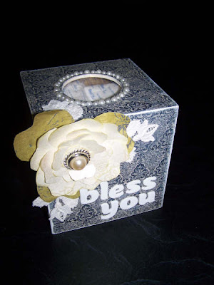
just a couple of things to share :)A tissue box, (a gift for a friend), and a layout... on a 6x12 !!I used a Page Maps sketch for the layout and found it helped ;)Found the template for the flower on the box on the internet.. thought the flower turned out ok.
Ok? It turned out MUCH better than just ok!! I would say bloody fabulous! Great job Sandra for extending yourself. Lovely delicate handmade flower, and very cute saying on the tissue box!
and OMG at your long skinny page. L.O.V.E. it!!! The branches, the embellishment clusters- all totally wow...... and I need to know where that little tiny pink bird is from this second!!
brilliant work!

Saturday, May 30, 2009

Marika - something new.


Marika says -
Hi Amanda, I have tried a different sized layout and loved it. I found it so easy to do with a 4 by 6 photo is just seemed to come together well. Also I have then been able to print straight onto my layout which I have never done before. This was a little scary I think I should have used bold type so that it stood out better on the dotty paper but oh well. P.s notice the type-ra font I was able to download and save it.
WOW Marika. I SOOOOOOOOOOOOOO understand what you mean about the smaller page being so easy and just coming together well. Love, love love what you have done here. And to be able to print straight onto he page is very liberating and opens up a whole new world of possibilities.
gorgeous page with the dots. And love that striking pink with the orange - really different and so eye catching. Great combination!

Ali E's tip of the day

9. Alphabet stamps in classic typefaces are great for the long haul. Here's a couple favorites: Hero Arts Printer's Type or Basic Upper Case.


ahhhhhhh stamps. *sigh* What she has written is so true - for longevity in your stash and an 'all rounder' for an alpha you cannot go past classic type stamps.

I just have to work up the courage to use them. ~lol~

How about you? Have you got many stamps? what are your favs that you come back and use time and time again?

Friday, May 29, 2009

Colour combo - Tiff

"This LO has been on my desk for a week before I could give it any attention. Life has become so frantic lately. lol. Wouldn't have it any other way tho.

The colour challenge fitted this just perfectly has the certificate has just the right colours already.

So without much brain strain, U R A star came into being.

Tiff"
Good to see a layout without a photo ... a great way to keep track of those Super Kid awards!!

Bazzill Matchmaker ...

I found the following site advertised in an American magazine ...

http://www.bazzillbasics.com/matchmaker/

It features Bazzill cardstock colours that match newer ranges of patterned papers by companies such as
- 7 Gypsies
- Basic Grey
-Cosmo Cricket
- Chatterbox
- Creative Imanginations
- Fancy Pants
- My Minds Eye
- Pink Paislee
- Webster's Pages

and more!!

So if you were to be ordering over the internet or at your local store you could ask for specific colours of cardstock to match the papers you were buying!

Would save time trying to match them yourself!!

Ali E's tip of the day

8. Note to self: there is no perfect layout. Forget about perfection; rather adopt an attitude that you will learn something from each layout you complete. Maybe it will be a new way to combine colors, create embellishments, or crop your photos. Maybe it will be that you totally dislike the way you did something. Make a mental note and move on to the next thing.

ok well this is something i need to frame and hang alongside this next tip (particularly the first sentance) -

11. Learn how to be self-critical without putting yourself down. How do you do this? As you create stuff ask yourself "does this really need this accent? Am I adding to the overall story or am I adding it just to add it?" There's no right answer - it's more about developing a general awareness and connection with yourself as you are creating. Be ok with stopping yourself and moving on to the next piece.

and yep i have skipped ahead a little bit. Dont worry - i will fill in the blanks in the next few days :) I thought these two fitted together perfectly so included a double bang for your buck today!

Thursday, May 28, 2009

Karen's - gone green


well actually i think i have gone green.
Listen to what Karen wrote -
Hi Amanda, Heres something I have been working on today at the Shack. It is a tin that some Prima flowers came in, I decided to decorate it and the plan is to make a mini album to fit inside (yet to be done) Thanks for looking.
Omg imagine working in such a cool place that there are fabbo little tins just there for the decorating.
I love this idea Karen - i can't wait to see the album you design for the inside - how cute!!! Ooooooooh at the tree, bird, sun, rainbow and that October Afternoon paper - just delicious!
This is recycling and going green in a great way!

Ali E's tip of the day

7. Expand yourself. Find something else to learn about next: a new interest, a new subject. Learning stuff fills you up, gives you more to draw from when you sit down to create.

A new interest, technique or finding a new way to present something always seems to give an extra zing in our old interests. Incorperating two together can be the magic that you need sometimes.