Wednesday, September 10, 2008

an apology and marika's page!

First up - an apology from me. Things have been VERY hectic lately for me and i have barely had enough time at home let alone catchup on computer/internet stuff. When i have been on the PC it has been flat strap doing grant stuff so as much as we all hate the B word....well things have been rather busy for me.
Hopefully by this time next week at the latest things should have calmed down somewhat and i can get back to my normal programming. LOL.

Anyway onto more interesting stuff - here is Marika's page and the great card she lifted from which was a Becky Higgins creation.


card from Becky Higgins Creating Keepsakes July 08
I just love how you interpreted this Marika. All the white spaces are so beautiful. Fabulous photo of Noah too - the black and white is absolutely stunning against the white cardstock.


Well done! Beautiful!!!


I did recieve another entry earlier in the week but some last minute changes were required before I can pop them up here ;-)


Finished this last night. Amanda made a beautiful card for Sean for his birth a couple of years and a bit ago.
So with this in mind and limited co ordinated PP i did this. Wanted to use red to take away from the pink bed cover and highlight Sean but keep some of the floral look. As you can see it has changed a lot on its way to being finished. In fact, it now really looks nothing like the card.
ah well... rules were made to be bent a bit.
The red dymo says 'caught red (little metal hand) ed. thought that was cute.
the metal thingies on the PP strip are from a belt that Annie grew out of a long time ago. Have been hoarding these for ages. LOL

my space

This is our office. I have taken over this room and call it mine. Straight after tea I disappear into here. I don't watch any TV at all because I am in here. Luckily it's big enough (sort of) to house another desk in there. So I am able to have stuff out on it and leave it there. But it does have the very important bar fridge. (Another device used as shelving)
I am very aware of the kids tho, I don't leave any sharp things on there or anything that may tempt them too much. They are good tho. Both of them have only touched my stuff once, and I roared at them enough to not touch it again. And they haven't.

I am a bit lucky I guess. Would love to paint the walls, get rid of the panelling and put up lots of shelving, but it wont happen in this life. So I'll just stick with what I've got

Tuesday, September 9, 2008

Maryanne's scrapspace

Maryanne says :
And just to remind you all to be grateful for your scraprooms/space, I have put up a pic of my loungeroom floor, which is my "scrapspace", and as you can see I make a hell of a mess, which is why I dont really do much of it when the kids are around!!!!Im sooo envious when I hear anyone mention their scraproom.mind you all I have to do is look up on my wall unit and see a pic of our sponsor child and puts it all into perspective really!!!can change my thinking from "glass half empty to glass half full".

Thanks for sharing your pic Maryanne. I'm about to photograph mine. And you are right, material things are nothing compared to your children and what they mean to you. I admire you for sponsoring a child. Have thought about it and that is as far as i have got. Lame excuse I know.

hmmm... its a bit quiet in here...pic of your space

so while u are all presumably creating your slant on Amanda's card lift challenge I thought of a quick pic of your creative space to post would be great.

The idea came from Maryanne's blog http://scarysstuff.blogspot.com/

Wherever you spread out your stash to make your masterpieces is where the photo needs to be taken.

post your pic to me (email addy's on right side of blog) as a small file.

take your shot.
save it on your computer.
find the file and right click on it
send to
mail recipient
say yes to make pics smaller
address it to Tiff
send
i'll post it.

cant wait to see a flood of pics.
try to limit your self to 2 pics. (good luck)

Saturday, September 6, 2008

Lisa IRL


whoo hooo.

A fair few bloggers met Lisa last night at the 5 Loaves Bakery Scrap Nite. (She's the skinny one in the middle with her hands on her legs).

Lisa came down from her home and went back the same night. 3 hour round trip. AND she had to work Sat morning, AND she had to umpire netball that arvo, AND she is going to Ceduna on Sunday.

HUMONGOUS Effort Lisa. So fantastic to meet you and on behalf of all of us, thankyou.

oh we're stepping out...

Just goes to show that inspiration can be found everywhere.

While Judy was tying up her shoe lace for her daily (i think) ritual, it broke in her hand. Being a true scrapper rather than tossing it out, it gave her a moment to pause...... and think..... hmmm I could use this in a layout.

and lo and behold

here is the layout.


awesome stuff Judy.

before everyone has a chance to say..... love the shoelace...... gives it so much dimension. stamped feet are so cute and the 'essentials' embellishments are fabo.
well done Judy.
now I reckon u should submit this.......

Spring challenge page

Hi everyone,

Great to see so many at the Five Loaves scrap night last night. A special hi to Lisa who traveled down from Wudinna - lovely to meet you Lisa, hope you wont be too tired today! Photo coming soon, hey Tiff.


Here's my page for the last challenge.


I must get a scanner, I must get a scanner, I must get a scanner!!! It would have to be easier and result in a better picture of layouts.

Hope to see lots of you sending in LO for Amanda's latest and greatest challenge! I know Tiff has an idea for the next challenge too!!

Friday, September 5, 2008

challenge 15

Ok this challenge i am stealing from Clair Bremner who originally stole it from the 2 peas website. I did this challenge a while back and loved it so much. So easy to do.

So i will pop in the link for Clairs challenges on her blog -

http://missymuh.typepad.com/whats_in_the_bicky_tins/old_bickys/

and the challenge this week is to (will copy Clairs words here as she explains it much better than i could!)


For this bicky you need to scrap a page using inspiration from a greeting card.
You can take as much or as little inspiration as you want but you must send
in a copy of the card you have used as inspiration. You can copy the color
combo, the layout, the quote, the theme...the possibilities are endless...

here are some links to some online greeting cards if you are like me and
too lazy to head down to the shops LOL

Hallmark - not a lot to be honest but it's a good place to start hmm on closer
inspection there is actually shit-loads of things you could get inspiration from
on this site LOL

Etsy - a good place for something a little bit different

Affirmations
- a card company with lots of nice quotes and things


Amanda back again - also if you google cards you might come up with a winner that way.


here is the one i did a fair while ago. I used the actual layout as the idea but changed my colour scheme. You might like to just use the colours or just the words. There are more examples of what has been done on Clairs blog link i posted above.

and the card i used for inspiration


email either Tiff or myself your page and also the card that has inspired you.

Just a tiny tip - if you find one on the www. print it out and have it next to your scrap desk rather than running back to the PC all the time. LOL - a good fitness routine but a real bugger for the creativity.

cant wait to see what you come up with!

how cute is this?


OMG Karen your work is so devine. The green on this is so fresh and 'spring-ish' it is fantastic. Love the little bird - looks like he is sitting in a nest with the little bits and bobs under him. The vine ...brilliant. You need to tell me where to get some of that vine rubon- i love LOVE LOVE it.
Great photo too. I love the different angle you have taken it from. Everything about this screams 'brilliant' at me. LOVE IT.

Here is mine. I feel so bad as i accidently 'stole' the title from Meredith......sorry chicken. I was going to rip it to bits and bin it but thought i would keep going and hope she didn't hate me too much for it.

Wednesday, September 3, 2008

a newbie!


Welcome Kate!


She has completed a page for Meredith's challenge which was to do a page on your work.


Kate is a dental therapist (as well as a busy mum like us all!) and she has done a fabulous page showcasing her job/career/work.


Those little handwritten notes down the bottom are so cute! Love the dymo ;-)

whoo hoo!!

http://escape2create.blogspot.com/2008/08/done-it.html

doing the happy dance.... big time.......

Tuesday, September 2, 2008

a touch of spring.

It is nice to see so many blog challenge entries coming in. This one has certainly put a spring in our step (ha ha ha)


First up is one by Marika who took the photo the same day she did the page! This big photo thing is all the rage and i think it looks fantastic. The little cluster of embellishments down the bottom are excellent and balance it all our very nicely. The canola is looking beautifully yellow at the moment so it is great to see it included here.


Secondly Sandra has gone all minimilist on us!! She says -

found a layout by Leanne Stamatellos.. and loved it.. (love her work!)
Its in Scrapbook Creations No.37 (vol5 no10) called As long as the Sky.
See you all on Friday ... sounds like a great night!


I dont blame you for wanting to lift Leannes work. It is stunning in it's simplicity and always looks classy. Your page is beautiful too Sandra...the strips of paper and the simple statement for a title. Very very eyecatching!


Thanks girls they are really inspirational!

Monday, September 1, 2008

food for thought

http://www.hp.com/products1/printpermanence/download.html?btnCompare=Free+download+%C2%BB+

this is a hewlett-packard link and of course they will plug their own products. But it does give u food for thought.

Every wondered how long your home printed photos will actually last for before they start fading. And they will fade.

download this and install. have a look. I deleted it thru control panel, add or remove programs after I had a play. Its just a demo and there is no need to clutter up your computer with it.

nothing like a little romance in the spring


OMG i nearly spat my cofffee clear across the room when i saw this LO in my inbox.


Maryanne has captured the most hilarious photo - just perfect for our spring theme! The dots, that spring time brush and your leaves are all so spring like and are excellent in this page. Wow at that peice of cardboard - LOVE IT!
How funny are those ladybirds. If only they knew that their session is now on the www! What would their mothers say? LOL.
Still trying to get over that dirty old ant having a good ol' perve as he strutted past! I be he copped an eyeful. I hope he averted his antannae.
Thanks Maryanne. This is a classic!

Lisa's job challenge

Well done Lisa. Bright and vibrant. And all that sewing by hand, wow. love the bold paint background. and the heart draws my eye straight to the main photo.
Lisa says....

LO attached for the Job Challenge. Would have been finished on Sunday if my %$#* Sewing Machine hadn't broken down. Had to manually turn the needle wheel (?) to put the holes in the LO and then sew it all in by hand!! Am really resisting the urge to add to this page, it feels a bit unfinished to me. I will be adding some names etc in the bottom Left Hand Corner when I get some Carolee Mini Alphas on Friday!


Also attached the page Tyla did today. She would really like it if could be put on the Blog too. This is from their Mini Olympics day. She was on the Ireland Team, hence all the green and orange. The things with the macaroni are the medals the kids won!

Hi Tyla

Well done on your LO honey and on your medals. Could u please remind me how old you are. I guess you may be 5.

Sunday, August 31, 2008

Tiff's Spring (ing)


My first attempt at a digi.

Very ordinary compared to Maryanne's and Sandra's. I'll need some coaching I reckon.

The photoshoot for this started with a disaster. The glass bottle of Claratyne syrup for the kids slipped clean out of my hands and smashed on the floor. Thick oozy syrup and glass all over the packages and sheet. After a moment of swearing and a bit of cleaning I started again.

I reckon I'll print this and use some thickers for the title and you tell me which one you reckon looks better.....????!!!!


rito. Printed it onto photopaper without the digi title and used thicker alphas instead. I like both just as much. the thickers for more impact and the digi title for is delicateness.
The printed version is not quite so black as the one in the digi LO. spoils it a bit.

hmmmm u tell me which one...

Tracey's gift


Tracey W says -


I have finally finished my mother in laws mini album that I am giving to her for her 60th birthday next month. I am really happy with how it has turned out as it is the first one that I have done. Kayes favourite colour is burgundy and I love all the papers that I have used


Wow this is amazing Tracey. Such a beautiful gift. I am sure it will be treasured!

Friday, August 29, 2008

Amy's all Aboard


I managed to catch a couple of shots of Amy's OTP creation when i was in Scrapworkz last night.
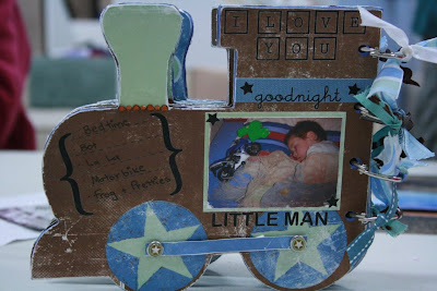
This is for her little boy and you can just see the love Amy has put into it.

Lots of details throughout the mini book. And it is still a work in Progress.Make sure you show him the blog Amy and see if he recognizes himself.

;)