Friday, May 22, 2009

Tracey - Sue's sketch


Now i am thinking that this is what everygirl needs around town - a set of handknitted bathers. Although i can see that they may work better for smaller children. Perhaps a cutoff age of 11 or 12 to stop any stray nipples poking through. Obviously Kaye had a VERY good knitter in her family - as you certainly wouldn't want any dropped stitches in your bathers!

Tracey says -


I have done another layout using Sue's sketch turned on its side. The journalling says 'Kaye Gregory at 14 months in her handknitted bathers at Henley Beach 1950'.


What a brilliant photo Tracey - how precious! Just have to love those random black and white snaps that are 'older' and have so much story to tell. Your collection of flowers, little tags, gorgeous rich colours and that little oval with the date really add to the vintage / heritage feel. I bet Kaye would love to see this one!

Thursday, May 21, 2009

Sandra - houndstooth


Oh my goodness. Have a look at what this VERY clever and VERY talented lady has whipped us up. SOME HOUNDSTOOTH CARDS.


Check out the perfection of them - the female images are just gorgeous Sandra! I can't stop looking at all the little details : the buttons, flowers, scallops, circles, rhinestones and lace.


Totally awesome Sandra. Gawd you rock woman!


Sue - houndstooth

Finally a page is complete!! Once i found a quiet moment, this page has come together quickly. Just one of those special moments caught with a camera that is too precious to just pop amongst all other photos.

Amanda - reuse and recycle


ok here is my late entry for Meredith's go green challenge.


I worked/fiddled/procrastinated a lot on it yesterday at Leah and Lindy's Scrap day and it looks nothing like i originally thought it would!


The round circle at the bottom is the title - The funeral.


The pink thing with circles missing is from an old peice of Heidi Swapp packaging which housed chipboard circles which have all either fallen out and lost or been used. In fact that is a bit of my stash that is at least 3 years old. The paper inside the circles is punched out of the sheet that you get in the front of a collection of papers - just tiny mini examples of what the pack includes. In this case it is from a really yummy collection of October Afternoon papers.


I have also noticed a new trend emerging which is to use the same photo multiple times on your page - repetition. I wanted to try this so used this picture that i snapped of G and K before heading off to the funeral last Friday.


The border is done by stitching two straight lines and using a un-picker to rip through to reveal the under sheet of cardstock. I blatently copied this idea from a page Meredith did ages ago and i loved the effect.


Sorry to rabbit on but i had a lot of questions about it all yesterday!


Maryanne - houndstooth


oh wow wow wow.


Why is it i love everything you do Maryanne? You just have that *knack* of putting exactly the right things and the right amount of right things on the page.


she says -


dont think I have any houndstooth in my stash, so have done a hybrid
page,searched and found a pattern.
theres some red and white up in the top left corner, and black and white in the right bottom corner, very teeny both of them but they are there....scanner has cut off my edges again.


this is absolutely adorable. Look at this one quickly girls - i dont think it will be on display for very long! Your digital elements along the side are so effective. And my-ho-my how young and in love you two look - whit wheel (wolf whistle!)


totally stunning!

Wednesday, May 20, 2009

Tiff - houndstooth


Tiff has sent in her houndstooth layout.
Annie looks so angelic in that photo - lovely. Very much like butter wouldn't melt in her mouth hey?!
The rose looks great extending off the page and the fancy border punch looks very flashy.

Tuesday, May 19, 2009

Looking for some colour inspiration?


A blog that I find good to look at for inspiration is the Colour Combos Galore challenge blog.

Each time they feature 4 colours and the design team have to create a layout with these colours. Others can submit their layouts too.

The design team are from all over the world and a few are from South Australia (Belinda Venables, Janine Koczwara and Steph Caskey-Devlin).

Something different to inspire you rather than a sketch or scraplift ...

From their blog ...
"THE RULES:You must use all the colors in the Combo any way you wish but stay true to the Color Combo. You are allowed to add in a neutral like black, white and kraft. You may also add another color but it should not dominate any of the other colors of the Combo. A new challenge starts every Monday and ends that Sunday."
Anyway have a look ... some of the combos are a challenge!!

marika - houndstooth


This is from Marika who used a May pagemaps design to get her creative juices flowing. And wow - your cup overflow-eth!
How you can make something so simple look so damn good is beyond me! This is really brilliant - love the circles made into scallops effect - and that branch is absolutely PERFECT for this page. Stunning in it's simplicity Marika!
Wow this blog is really pumping atm isn't it!!>???? I am sure the new look and various challenges have got us all inspired!
Keep sending in your work girls - challenges or just other bits you are working on. We love to see what you are up to. We can encourage and enthuse each other!

Free download from Ali Edwards

Ali Edwards, an American scrapper, has a very inspiring blog where she shows her scrapping.

A lot of her style features documenting the everyday things.

I love it and check out her stuff regularly.

At the moment she has a feature on documenting your weekend. She has a free downloadable file of the words Saturday, Sunday and weekend, in her handwriting.

http://aliedwards.typepad.com/_a_/2009/05/weekend-creative-document-your-weekend.html

Check out her blog for this and much more.

amanda - houndstooth challenge


*slinking in*


ok sorry guys it is me again (blush)


Just showing you my houndstooth layout for May's challenges and i promise i wont post anymore.

Monday, May 18, 2009

amanda - photo challenge


sorry girls for the hog but i have just found the photo that i took on Mother's Day of my sisters little dog called Fluke and lo and behold it seems to fit our photo challenge!


This shot is SOOC (straight out of camera) and i am really pleased with how intense his little eyes are!

amanda - Sue's sketch


this is a bit abstract but i did follow the sketch. The only difference is changing the title placement.


Journalling reads - We are far from perfect but our house is full of love. That is what counts. We really are a party of 5.


Have another half finished - today was productive scrap wise!!


Maryanne - sue's sketch


Oh how perfect this page is! LOVE it. So true to Sue's sketch and just basically so much lovely stuff going on it is hard to know where to start. Love those cool flowers, the tiny letters and your 70's feel paper choice. And omg at that photo - i had a little laugh when i opened it up as i can remember you guys looking exactly the same..........felt like i had done a little time warp back to JP at school!


great work Maryanne. Sue's sketch is very inspiring isn't it?

Sunday, May 17, 2009

just thought i would let you know........

a little birdie told me about a deal going with subscribing to Scrapbook Trends which is for a very limited time.

I think it is quite good value so thought i would pass it along. This magazine is FAR AND AWAY the best scrap mag i have ever seen.

Click here for details

or you can pick whichever other 'free' magazine (6 issues) you would like to go with it here

busy busy

Hi all.


Well it has been a bit quiet in here over the weekend - like me i guess everyone is flat strap with life in general. Personally we have had quite a full on week, with a funeral and catching up with family. Scrapbooking and this blog (sorry guys) have been the last thing on my mind. Today i have felt the urge again so i think i will have a go at one of the challenges soon!


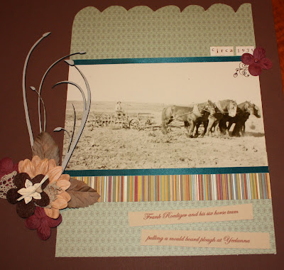
Luckily we have been saved of complete bordem by Trace sending in a fantastic vintage page.


Tracey says -


Attached is my very badly photographed, equally badly cropped photo of my layout
for the May sketch. i have so got to learn how to scan or photograph these
things without getting bad light reflection and to counteract the reflection
then I then photograph on a lean. I am kookie, I've officially lost it, I swear
I am going to get computer savvy like I was before children came on the scene
and my will to learn went pear-shaped!! Enough babble - the layout is an old
farm photo, the journalling says 'Frank Roediger and his six horse team pulling
a mould board plough at Yeelanna'. This sketch has helped rekindle my interest
in making time to scrap something. Thanks Sue.


WOW Tracey. This is fantastic. That chip stalks/flower, the gorgeous vintage colours, and the little 'circa' words up the top are brilliant. What a totally awesome photo too - lucky devil! Beautiful, beautiful work. Thanks for sharing and we hope that you continue to be enthused by our challenges!

Thursday, May 14, 2009

Sue's sketch ... Tiff's layout

"Answering Sue's sketch challenge.

I have remained faithful to the sketch. The embellishment is actually a head of oats. (Came from Jerry's hay, not from that paddock which happens to be barley.)
I really enjoyed this challenge Sue and this LO came together so easily.

Tiff"


Wow Tiff ... that looks great!! The laser cut "family ties" is beautiful and the oats very effective. Beautiful soft tones of the patterned papers too.


Thank you!!

Tiff's photo for the challenge ...

Tiff said ...

"Found this little peacock feather last night when the kids were feeding the chooks.

So I grabbed the camera and followed it as the breeze blew it along our house yard.

Contrasts so well with the new fresh green grass.

I kneeled above it to shoot down. And I did get wet knees lol.

thanks
Tiff"

Wow Tiff the colours are irredescent!!

Sue's Sketch ...

Great sketch Sue ... found my ispiration while lying down trying to get Hannah to have her afternoon sleep on Tuesday ... after 1 hour she was still awake so I set to it!!

Wednesday, May 13, 2009

Marika


Some gorgeous 'looking down through the lens' photos from Marika. Gosh this second one is stunning in the colours. What a cutie Miss B is!


And a page for Sue's sketch. Love those swirls and the tree/heart/butterfly cluster! ooooooooh dont tell me you have that yummy stampin' up diecut punch too? *swoon* Great colours! Teal blue and kraft were made for one another i think!

Tuesday, May 12, 2009

Sandra (sue's sketch)


Yikes this girls is hot off the mark!

She says -

You have got my mojo happening already!
I am home unwell today and unable to sleep or sit still...I have been stuck on the one layout for days.I had the papers, the embellishments, the photo, and wanted to use the rolled paper,(which I saw on the net somewhere)
I was just stuck putting them all together.Saw Sue's sketch, flipped it on its side and VOILA!!
So now my layout is finished!! Thanks Sue!!

Those little rolls of paper look amazing! Fantastic job Sandra - wow! Hope you feel better soon - but what a way to spend a sick day - scrapping some incredible pages!