10. Layer. When you are putting a layout together think in terms of layers: cardstock, patterned paper, transparency, stickers, stamps - what can you add on top of the last layer to make the piece more interesting?
this is a great tip on how to get the basics of your page constructed. Of course you wouldn't use transparency/stickers and stamps on every page but this is the guts of how to layer.
It sounds easy right? LOL - now off to create!

Sunday, May 31, 2009
Sandra - something new

.JPG)

hmmmmmmmmm maybe Ali E's tips for trying something new is catching on!!
Sandra says -
just a couple of things to share :)A tissue box, (a gift for a friend), and a layout... on a 6x12 !!I used a Page Maps sketch for the layout and found it helped ;)Found the template for the flower on the box on the internet.. thought the flower turned out ok.
Ok? It turned out MUCH better than just ok!! I would say bloody fabulous! Great job Sandra for extending yourself. Lovely delicate handmade flower, and very cute saying on the tissue box!
and OMG at your long skinny page. L.O.V.E. it!!! The branches, the embellishment clusters- all totally wow...... and I need to know where that little tiny pink bird is from this second!!
brilliant work!
Saturday, May 30, 2009
Marika - something new.

Marika says -
Hi Amanda, I have tried a different sized layout and loved it. I found it so easy to do with a 4 by 6 photo is just seemed to come together well. Also I have then been able to print straight onto my layout which I have never done before. This was a little scary I think I should have used bold type so that it stood out better on the dotty paper but oh well. P.s notice the type-ra font I was able to download and save it.
WOW Marika. I SOOOOOOOOOOOOOO understand what you mean about the smaller page being so easy and just coming together well. Love, love love what you have done here. And to be able to print straight onto he page is very liberating and opens up a whole new world of possibilities.
gorgeous page with the dots. And love that striking pink with the orange - really different and so eye catching. Great combination!
Ali E's tip of the day
9. Alphabet stamps in classic typefaces are great for the long haul. Here's a couple favorites: Hero Arts Printer's Type or Basic Upper Case.
ahhhhhhh stamps. *sigh* What she has written is so true - for longevity in your stash and an 'all rounder' for an alpha you cannot go past classic type stamps.
I just have to work up the courage to use them. ~lol~
How about you? Have you got many stamps? what are your favs that you come back and use time and time again?
Friday, May 29, 2009
Colour combo - Tiff
"This LO has been on my desk for a week before I could give it any attention. Life has become so frantic lately. lol. Wouldn't have it any other way tho.
The colour challenge fitted this just perfectly has the certificate has just the right colours already.
So without much brain strain, U R A star came into being.
Tiff"
 Good to see a layout without a photo ... a great way to keep track of those Super Kid awards!!
The colour challenge fitted this just perfectly has the certificate has just the right colours already.
So without much brain strain, U R A star came into being.
Tiff"
Good to see a layout without a photo ... a great way to keep track of those Super Kid awards!!Bazzill Matchmaker ...
I found the following site advertised in an American magazine ...
http://www.bazzillbasics.com/matchmaker/
It features Bazzill cardstock colours that match newer ranges of patterned papers by companies such as
- 7 Gypsies
- Basic Grey
-Cosmo Cricket
- Chatterbox
- Creative Imanginations
- Fancy Pants
- My Minds Eye
- Pink Paislee
- Webster's Pages
and more!!
So if you were to be ordering over the internet or at your local store you could ask for specific colours of cardstock to match the papers you were buying!
Would save time trying to match them yourself!!
Ali E's tip of the day
8. Note to self: there is no perfect layout. Forget about perfection; rather adopt an attitude that you will learn something from each layout you complete. Maybe it will be a new way to combine colors, create embellishments, or crop your photos. Maybe it will be that you totally dislike the way you did something. Make a mental note and move on to the next thing.
ok well this is something i need to frame and hang alongside this next tip (particularly the first sentance) -
11. Learn how to be self-critical without putting yourself down. How do you do this? As you create stuff ask yourself "does this really need this accent? Am I adding to the overall story or am I adding it just to add it?" There's no right answer - it's more about developing a general awareness and connection with yourself as you are creating. Be ok with stopping yourself and moving on to the next piece.
and yep i have skipped ahead a little bit. Dont worry - i will fill in the blanks in the next few days :) I thought these two fitted together perfectly so included a double bang for your buck today!
Thursday, May 28, 2009
Karen's - gone green

well actually i think i have gone green.
Listen to what Karen wrote -
Hi Amanda, Heres something I have been working on today at the Shack. It is a tin that some Prima flowers came in, I decided to decorate it and the plan is to make a mini album to fit inside (yet to be done) Thanks for looking.
Omg imagine working in such a cool place that there are fabbo little tins just there for the decorating.
I love this idea Karen - i can't wait to see the album you design for the inside - how cute!!! Ooooooooh at the tree, bird, sun, rainbow and that October Afternoon paper - just delicious!
This is recycling and going green in a great way!
Ali E's tip of the day
7. Expand yourself. Find something else to learn about next: a new interest, a new subject. Learning stuff fills you up, gives you more to draw from when you sit down to create.
A new interest, technique or finding a new way to present something always seems to give an extra zing in our old interests. Incorperating two together can be the magic that you need sometimes.
A new interest, technique or finding a new way to present something always seems to give an extra zing in our old interests. Incorperating two together can be the magic that you need sometimes.
not long now................
until the end of the month which means...
the start of a new month and NEW challenges!
Now who is hanging around patiently waiting? Leave us a little hello below!
Don't forget you can show us anything you are currently working on - we really love seeing your creations.
and don't forget you can email your images to either Sue, Meredith or myself. (i was feeling like a bit of a blog hog last month!)
Meredith posted a couple of really funny links and that made me think about the art of writing blogs. Some people are very clever and can make you cackle with laughter at the screen.
Lynette Van Barello is one of those funny writers.
Cathy Z is another which often has me in fits of giggles.
i have also stumbled upon this blog The Scrapbook Widow which is written from a husband's point of view. His earlier posts are more about scrapping and less about coffee and are really funny. It hasn't been updated for a long time which is a pity.
Let me know if you come across any blogs that make you chuckle.
Wednesday, May 27, 2009
Sandra - trying something new.

This chook is gaining so much confidence it is so lovely to see. She says -
been playing today, trying a few new things.
Bright colours, large photo on a smaller sized paper.
This is really beautiful Sandra. The journallingyou have included, those yummy colours and a great photo make this a stunning page.
Fan-bloody-tastic.
Ali E's tip of the day
6. Repetition. Probably my favorite design principle: do something once and then do it two more times. Three is a very nice number. Repeat colors. Repeat shapes. Repeat accents.
clever.
creates harmony and balance.
and
gotta love this next bit...................
easy.
clever.
creates harmony and balance.
and
gotta love this next bit...................
easy.
Tuesday, May 26, 2009
Ali E's tip of the day
5. Keep an inspiration journal. This is the one of the best things you can do for your creative self. Don't judge what you write in it or put in it - just use it and abuse it and let it be a place for the things that are scrambling in your head. For a long time I have had too many of these and it began to feel way to scattered. Recently I have combined it into one notebook - forcing myself to use just one and go with it.
This has been one of the best things that i have done. Over a year ago i made myself a little diary to put snippets of inspiration for scrapping. While it sounds a bit anal, I was sick of walking around and seeing design elements that i wanted to try in the world of scrapping and then promptly forgetting them. I have since stuck images that i would like to scraplift, or just some elements from pages that i would like to try, and written in colour schemes that catch my eye, quotes or just a general idea / theme for a page. Often i will write the journalling that i would like to have on my page well in advance and have it all ready to go.
This is a hugely helpful scrapping tool to me. I would love everyone to try it - if you have a spare little notebook to write your ideas in i am sure you will find it a massive help / mojo boost too.
Mine is titled 'see art in your everyday' as i really do see ideas everywhere. Look around you and i am sure you will too :)
Monday, May 25, 2009
Ali E's tip of the day
4. Mix up your page sizes. For the last year I have been experimenting with all sorts of different sizes - this is a huge creative boost. Online lately I have seen really cool pages that are 6 inches x 12 inches, 4 inches x 12 inches, 8 inches x 8 inches, etc. Don't limit yourself to one size.
I think this is the biggest hangup some scrappers seem to have. Let me tell you from my own experience that i never felt more inspired than when i changed to an A4 (or 8.5 x 11 inch) sized page. Although i find it much much easier now, i also dont limit myself to ONLY doing that size. If i feel like a 12 x12, or things look better on a bigger page = well i do a bigger page.
I also have done 3 or 4 layouts with the long skinny size (12 x 6 inch) which were also great to get that mojo flowing. It challenges you to think about your page a different way.
Dont be scared to try different sizes. There is a much bigger world out there than just 12 x 12.
Karen - Sue's sketch

Karen Says -
I have finally gotten to a LO. This is Sues sketch, mind you I always start off planning to be true to the sketch but end up wandering off the track a bit!! You can sort of see, if you squint!!
Oh Karen...that brown with the BG stripe is delicious. And that little birdy rubon coming out from the calendar card is a sweet touch. Love your little highlights in red and i really need to know what kind of alpha you have used for the main title - got to have some of those!
Glad to see you back in here. Hope all has settled back to normal at home and you can fit a little bit more scrapping in. Great work.
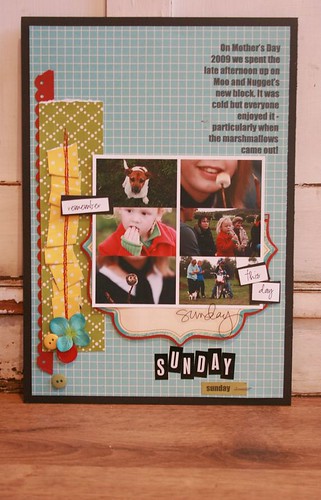
Sunday, May 24, 2009
Sandra - colour challenge

gee wizz - my inbox has been overflowing with pages lately! It is great to see so much action and support on the blog - well done everyone!
Sandra has sent in her page for the colour challenge. Love that background - so bright and vibrant. The other colours just seem to set it all off brilliantly. Those flowers coming off the blue strip = stunning. Also love how the main cluster - photo, title, date and journalling is all at the bottom. Very clever design which works so well here. It has a nice sense of balance to it all.
Great job Sandra


Marika - sue's sketch

goodness we are all getting so much inspiration from Sue's sketch. Marika has rotated this for a classic black, white and pink layout about her precious fairy! I am also loving how you trimmed that photo down - nice a skinny. I have also noticed that this is a bit of an incoming trend so you are right onto it Marika!
Love your choice of papers against that pink - striking!

Subscribe to:
Posts (Atom)