Saturday, June 12, 2010

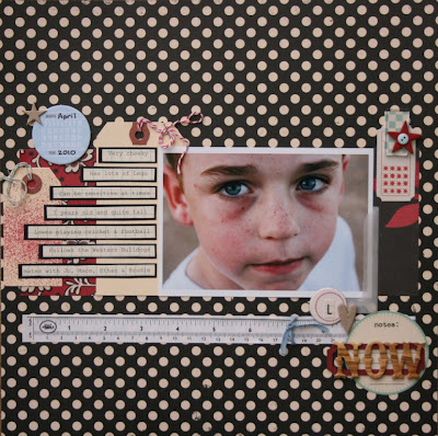
Tiff - sketch challenge

And i also had Tiff's sketch for this month waiting for me...great to see everyone has been getting some scrapping done!

Heya Sue.
I've done your sketch challenge today. I've tipped it upside down and matted the journal block before using foam tape to place it above the PP. And have a close look at the button. Its 3D. I used some HS ghost butterflies on top of the butterflies that were already on the button.


cheers chicky

tiff

Love the colours Tiff, and the worn edges with the stitching...looks great!! Great fun photos...the kids look like they are having a great time! The 3D clear button with the butterfly looks really effective! Great take on the sketch!

Thanks for sharing it with us Tiff. xx

Michelle's - sketch challenges

Firstly i want to apologise for been absent this week....just haven't had a spare moment to check my emails or do any posting.

But in my in-box i found Michelle has sent me a couple gorgeous LO's, the sketches from last month and this month!

Hi Sue
Sorry I’m late with this one.
Here is my take on last month’s challenge.
Cheers
Michelle


This Month's:
I just love the colours of this Michelle, so soft, and the hint of inking around the edges blends the colours all in gorgeously!! Love that flower!! And what a cute little face knitting away!!

Last months sketch:
I am glad you decided to send this and show us all....just love it...that chip butterfly swirl is beautiful with another yummy flower there too! Great take on the sketch Michelle.

Thanks for sharing these Michelle. xx

Friday, June 11, 2010

Long weekend challenge ...

Okay ... back already!!

My inspiration comes from

... here

and

... here

Create a layout or even an off the page item with  fabric somehow incorporated on it!

Can't wait to see what you come up with ... email to me!!

I will wait until Monday to have a go at this as I have visitors until then ... my youngest sister and her family will be arriving soon!! Can't wait to see them!

And they are sleeping in the scrap room!!

Little 1 and 3 year old boys don't go well with scissors, paper and glue so it is all packed up on the cupboard and elsewhere!!

But the best bit is that at least I'll have some great photos to scrap after their visit!!

Long weekend challenge ...

Hi all!

I will be back at some stage soonish with a long weekend layout idea / challenge!!

Stay tuned ... need to get my thinking cap on!

For those of you going away ... have a wonderful break!!

Sue's sketch - Meredith

Thursday, June 10, 2010

Scavenger hunt - Maryanne


"here's my scavenger hunt layout....bloody hard work too!!!

OA label sticker

font, sweetie pie, from dafont

vintage image is the digital images in the bottom right hand corner

2 green circles are the brad and I'm counting the little green paint splatter digital brush as a circle.

1 photo

red ribbon [with white too]

folded corner

date title."

Photo by Tiff Firth Photography.

Fantastic Maryanne ... I did look for a little while for the 2 green circles and then felt silly ... very creative!!

I really like that font too so off for a look and download I reckon!!

Tuesday, June 8, 2010

Sue- colour challenge

This colour challenge was really a challenge for me, these are not colours that i would normally grab for, let alone have in my stash. Once i bought some orange cardstock, i found some of my favourite OA papers, and slowly i worked it out!


Monday, June 7, 2010

Marika - scavenger hunt

Would you believe it but this is Marika's first EVER vintage page??!!!

So not only has this chickadee done the tricky scavenger hunt challenge BUT done it vintage style. LOVE IT.

I was almost tricked with the green circles until i noticed the buttons! Beautiful photo and you really did it justice Marika. Well done.


Amanda - scavenger hunt


new font : Doctor Soos

Sunday, June 6, 2010

scavenger hunt - Meredith


My bits:
2 green circles ... the flower
vintage image ... a doily rub on
sticker ... at the top left of the photo
folded corner ... at the top left of the photo too
new font ... American Typewriter LH Lt Cd
Oh and my new favourite tool ... a Tim Holtz tiny attacher ... cute little staples!! Beautiful to use!! As per the folded corner and how I attached the twine!

A funny thing with this layout ... I saw Sue at football yesterday and she said she had uploaded her "scavenger layout" so I set myself a challenge ... not to look at Sue's until I had posted mine!!

I am so keen to see hers now and I think it made me get mine done!! So now I am off to check it out!

Saturday, June 5, 2010

Sue- scavenge hunt

At first this challenge of Amanda's had me stumped, but then i found these photos of Ethan and i found this old cosmo cricket paper...then the rest just fell into place. When i went to place the white tag with the stapled twine i noticed on the pp there was a vintage image of someone dancing...can you spy it??..i didn't notice it at first. My new font is Prissy Frat Boy. Hope all the ingredients are there..

Good challenge Amanda! Can't wait to see what everyone else comes up with.

Sue x

Wednesday, June 2, 2010

Maryanne - WOS

hi amanda


I have attached a LO which Ive done.I was inspired by this Layout which I absolutely loved, by Armance on 2peas, where she had printed song lyrics on her background.


 Mine is using the song "Nothing Else Matters", by Metallica, which actually holds a lot of meaning for me at the moment.


My white cardstock is covered in text, but as I have scanned my LO, and have some dimension on it, it hasnt scanned very well.[sorry].


cheers maryanne


I keep thinking to myself 'wow wow wow' when i look at this Maryanne. I totally LOVE the lyrics idea and the song you have used by Metallica is perfect.....i have had that singing in my brain since i first peeked at this layout this afternoon!

Love how you have taken the colour scheme and lyric idea but totally made it yours.  I am in absolute awe of what you do. It is always stunning.

Beautiful. Just beautiful.

June Sketch Challenge

Great challenges there Amanda...hmmm....they will have me thinking, especially the scavenge one!

Well, here is my sketch challenge for this month. For those of you who have popped into my blog you may have seen my 'summer days' page that i have based this sketch on. It is a good one to use up those multiple photos from just one occasion, placement is totally up to you, along with some pp's and pop some journalling in amongst it too.

Here is my example:

Have fun with it and i look forward to seeing what you all come up with!!

Suexx


Tuesday, June 1, 2010

June Challenges

the scavenger hunt.


Idea from scrapboxx and Sue

To incorperate all these elements onto one page.


  • an odd number of photos
  • red ribbon
  • a vintage image
  • a folded corner
  • two green circles
  • a date used as the title
  • loops of string/twine fastened with staples
  • use a new font for journalling
  • a sticker


Can't wait to see what you come up with!


colour challenge

cream, light grey and mustard yellow and orange sunset. Inspired from the grey and orange delight in  Meredith's Good Friday layout!


Dont forget - the more the merrier. Please join in! If you do not want to join in the scrapping side of things,but enjoy looking at our blog please leave a little comment. This encourages us to continue with the e2c blog and lets us know that we are not just prattling on to ourselves here!!

Sunday, May 30, 2010

Stamp cleaning ...

Me again ...

Just found this post over at Studio Calico and thought it was very interesting ...

http://www.studiocalico.com/forums/topic/23034

The link to the original Tim Holtz topic ...

http://timholtz.typepad.com/my_weblog/2010/05/how-do-you-distress-day-4.html

You can also see Tim's other posts on distressing at his blog ...

http://timholtz.typepad.com/my_weblog/

Happy stamping!!

Clever idea ...

Hello ... I have been MIA lately but thought I'd stop by to post this great link ...

http://mayaroad.typepad.com/dt/2010/05/a-useful-post-color-swatches.html

There is also an example for fabric!

Obviously we may not have easy access to Maya Road mist but Tattered Angels Glimmermist is available locally!! :-)

Saturday, May 29, 2010

WOS - Tiff

inspo from Sandra with her picket fence with the roses poking thru it.


inspo from Color Room Palette 6 for the colour scheme and the bones of a sketch.


inspo from Twiddleybitz for the May nude chip challenge.


and of course inspo from e2c blog for getting me off my butt and getting this one done.


;p


cheers Tiff


(sorry Tiff but the bigger sized option is pixelating for me)

Love those 'nude' chip people. I much prefer chip to be left naked so this is a great challenge idea.

The look on Paige's face is pure love. This is beautiful... and the journalling spot on. Honest without bullshit and fluff. Brilliant.

Great job!


Sue's sketch- Janice


Hi Sue,

I have had this page done for awhile now and just never got around to photographing etc to put on the blog (Im not very good at the photographing and cropping bit).
After a phone call today from my good friend, I was asked if I would share it so decided it was time to send this email to you.
Thanks for another great sketch, look forward to the next one.

Janice

Wow Janice...thanks for sending this one in....i just love the colours and papers!! I love how you have mounted the journalling...i am seeing alot of this lately and just love it! Great photos and you have scrapped them beautifully!

Tuesday, May 25, 2010

Sue - WOS

When i saw this LO of Sande Krieger over at 2peas...i knew i had to lift her page...totally!!

With our bags all out ready to pack, travel brochures laying around everywhere and the excitement of actually going...her page was just the perfect idea for me scrap us getting ready for our first trip OS. So out came all my old 'mail art' stamps and new label stamps and away i went. I even had the OA Road trip range in amongst my stash...surprise surprise!

Here is my page:


Here is Sande's:

Like i said....an exact lift! But why change something if it is just perfect? I love her LO!

Monday, May 24, 2010

Tatum - WOS

Hi Amanda,
Here is my 3rd challenge Layout.

I've taken some of the common elements and style that the very beautiful Mardi Winen uses on her layouts. Mardi is an inspiration to me for so many reasons and I was lucky enough to do a couple of classes with her last year which gave me some great insight into the way she creates.

I have used some scrap strips from my recent projects, machine stitching, 8.5 x 11 and a story about everyday life...all things that I associate with Mardi's style.

As far as techniques go I have used my new favourite...a bit of heat embossing on the flower :)

Tatum xx


wow wow wow Tatum.

This is stunning. Amazing. Just awesome. LOVE your colours - i really am in heaven looking at all your beautiful elements.

Stunning use of colour.

and so glad to see some more Mardi inspiration :)


Marika - WOS

Hi Amanda,


A lift from fran tynans blog a layout called easter. It is great to get some pages done have used this green patterned paper that i think has been sitting in my pile for several years.


Thankyou Marika


and here is Fran's original:


Great work Marika. Fran is so inspiring!! Those red accents on yours really pop against the kraft and green. Beautiful job.


Karen - etsy and WOS

Hi Amanda,


Did a bit of scrapping yesterday while we were getting that lovely rain. First is my scrap lifted LO which I have lifted off of your "She" challenge LO from last year, I have also used some 7G gaffer tape (which I have been wanting to use for ages) also some OA rubons (which I seem to collect but never use) Second is the "Goodie Bag" challenge, while I didn't use the goodies from inside the bag I did use that gorgeous big flower that was on the outside of the bag! Thanks for looking.


Karen D


The original:


Love how you have changed the whole feel of this page Karen. In fact i did not recognize it at all! Yours is so bright and funky - i like it a lot more than the original!!


And here is her etsy creation:


I am just drooling over this. DELISH!! Love the simplicity - it makes a HUGE impact!

As usual you have totally wowed me Karen! Awesome.


Sunday, May 23, 2010

WOS - Sandra


OMFreakingGoodness.

This has blown me off my little computer chair. T.O.T.A.L.L.Y.  I.N.  A.W.E.


This is amazing Sandra. Bloody incredible infact.

She said:

Hi Amanda


Isn't this rain WONDERFUL?

Here is my Scraplift. It a photo of me and my childhood companion Pointer.

I lifted a layout by Wendela :


Love her work.


I found the process of using just a piece of cardboard as the 'background' instead of the traditional cardstock or pp VERY liberating!!


I think I will be trying it more often!!


Cheers

Sandra

Again i will say that you have blown my socks off Sandra. This is amazing.


WOS - Amanda

The next scrap item in my stash that i chose to work with and lift a layout which is based upon such item is....

Heidi Swapp mini clock overlays!

I had bought these some time ago and felt stumped how to use them. After a fair bit of googling i found this layout by Talia Audenart


Admittedly it isn't the same sort of clock - the one Talia used is the big 12x12 sized ones but i thought i could use it as a base or jumping off point.

Here is my layout:


I really liked the title on the original and how it worked in with the clocks so i tried to copy that. 

It's a bit of a nothing page - no meaning or substance to the words - which irritates me but i am glad to have finally used some of my HS stash!

Friday, May 21, 2010

WOS - Marika

Marika has stumbed on a layout on Mardi Winens blog and felt inspired to do an almost exact lift because she loved it so much.

Mardi is a very inspiring person, her scrapping style is so 'up my alley' that i always feel like delving into my scrap stash after looking at her work. The colours and fabrics she uses are so clever.... so i don't blame you at all for picking her Marika!

You have done a fantastic job! I love the alphas you have used, the beautiful OA papers, the cluster of beautiful elements in the corner and of course that stunning photo of Bella.


and here is Mardi's brilliant original:


WOS - Tatum

Tatum isn't lifting as such but finding inspiration in others work and the techniques that they use.

The first amazing example is inspired by Lou Nelson who has a very recognizable and unique style. Tatum was enthused to try hand drawn and cut elements ala Lou style. New product is the American Crafts Botanique range (PP and chippies)


The second page was inspired by Dina Wakely - in particular the glimmer mist and masking techniques.


These are fab Tatum. I just love your style of colour - it is like eye candy glancing from bit to bit looking at all your texture and detail! Beautiful.


Wednesday, May 19, 2010

Amanda - WOS

Ok here is layout two from my week of scraplifting.... although this is NOT a scraplift lol.

In my quest to use things up that are in my stash screaming 'use me' but i don't know how, i decided to pull out these babies:


These are little mini vellum journalling cards from Websters Pages that i bought a fair while ago. I have looked at them several times since, and haven't really known what to do with them, and really feel sick when i put them away again as they were quite expensive at the time.

Now i would suggest that they haven't been a huge seller for Websters, as when searching for a project to lift i could basically find NOTHING... not even on the Websters gallery. I am wrong about quite a few things in life so it's possible i am totally off track with that comment too.

While i didn't find a lot of vellum journalling card pages - what i did find is a whole lot of inspiration that made me come up with this layout.

Inspiration from

  • here for the blue dots to be teamed with it all

  • here for the cutouts of vellum and use of lots of flowers

  • here for the button and string
so here is mine (sorry about the terrible night lighting for the photos)


I really wanted that floral look, without being too fussy or busy. There was quite a story i wanted to tell so to maintain the space i hid the journalling under a flap. It is funny to think that these vellum notes have been in my stash for so long i was really regretting buying them and yet i really like how this page turned out!


Sue - WOS

I have completed a direct scraplift of a page of Leanne Stamatellos'... i like her simple and effective style...a great style for a nice quick boost of scrap mojo.

Here is Leanne's page:

Here is mine: using some new OA papers and some old American Crafts chip shapes that i got from Spotlight a year ago (i think?!). I love the embellie cluster in the corner that Leanne uses leaving the page with plenty of 'white space'.

Wow, i am feeling all enthused to scrap now......i'm off to find another page to do!!

Tuesday, May 18, 2010

Amanda - WOS

WOS (week of scraplifting) has kicked off with my new October Afternoon and Basic Grey papers.... oh how i love both of these brands!

I really wanted to do something beautiful and different with these new papers so i decided to look on the OA website. WOW talk about inspiration plus!

The layout i chose just happened to use exactly the papers that i had in my stash - so i have copied it absolutely.... it's basically a carbon copy. Usually when i scraplift it isn't so exact - but i loved this page done by Iris Babao Uy.

It is just so freeing (and quick) to copy a page... i love how it can fire up your enthusiasm again to scrap. The other thing is that i have used some of my new products in new ways - (all that fiddly cutting so isn't my normal thing) - so am trying to branch out and try something different and new for me.


here is Iris' page:


and here is mine:


Obviously i have changed the size and a few different elements but the 99.9% is Iris' work.

hmmm i wonder what products i have in my stash that can use up next?

Monday, May 17, 2010

mid month challenge...

Meredith's posts below have had me thinking a lot about scraplifting.... and this week i am going to celebrate the inspiration that i get from others by SCRAPLIFTING (and giving credit) a few layouts. Originally i was thinking 7 in 7 type of thing but i don't want to promise something i can't deliver ;-) so i will just see how life pans out as to how many i do.

Anyone want to join me?

For the past couple of weeks i have been feeling blah again with scrapping and mojo. We all know that this ebbs and flows and in an effort to combat this i did a mini clean up / clean out in my scrap room yesterday. I found A LOT of product which i have wanted to use for a long time but haven't yet found inspiration.

So i have done a back to front type of scraplift. I have found something in my stash that i want to use, say a Hambly transperancy for example, and found a page on the www. that i want to copy and voila...... i am scrapping again!

Two bonuses - use my stash and crank up the creativity.

(and also to say THANKS to those that inspire us!)

I hope others join me on this scraplift week. I wonder how many we can do?

Tatum - Sue's sketch


This is Tatum's scrapping - Sue sketch style! She said that it evolved a bit from the original sketch design (flipped on the side maybe?) but OMGosh isn't it all delicious!??


That bright red and white dot teamed with all those stunning brights are delightful. What a beautiful, inspiring creation and a great job making a sketch work for you.

Sunday, May 16, 2010

A little bit of Etsy - Meredith

I only had a few of the leftover Etsy bag goodies but thought I'd post this layout here! Twine, tapemeasure,patterned papers, ticket & a tag leftover from my class!!

Saturday, May 15, 2010

Okay further to my previous post ... !!!

Okay time for a few questions ...

Step 1.

Take a look at this layout ... here

Step 2.

Now look at my layout ...


Questions ...

Do you think it is a scraplift?

Do you think I was just inspired by the original design? Is that the same as scraplifting anyway?

Should I or should I not submit my layout to a magazine?

Oh just to add ... the little flag at the top was inspired by Waleska Neris in this post (fourth layout down)!!

The etiquette of inspiration (title title-lifted!!)

There has been two really thought provoking posts over at Studio Calico this week.

Post 1 ... here : How shall we be inspired?

Post 2 ... here: Shall we scraplift?


As well as ...


Post 3 ... here: Where shall we store inspiration?


I would be interested to hear peoples' thoughts on this!

Do you think this information is over the top or the right thing to do???

Friday, May 14, 2010

Sandra - gone etsy

Hi Amanda


I know I said I wouldn't send in another 80's photo, but I lied ;-)


This photo was taken of TWO of the retreat goers way back in the 80's.


one is me, ofcourse...but who is the other??


Taken on 'muck up day' ..


we rode to school on a motorbike (in our wedding gear ROFL) and even had the tin cans hanging off the back!!


and we received a few odd stares on the way let me tell you!!!

And the layout also has a couple of etsy items on it.... the crepe paper and the etsy bag itself.

Inspired by Anna Christen-Larson


Well bye for now...


and I Pinky Promise no more 80's photos!! ;-p


Sandra


This photo is a classic. I can pick 'the groom' EASILY LOL.

Beautiful layout with awesome title Sandra!! LOVE LOVE LOVE that big chandelier. Inspiring work.... brilliant.

Jenny - Sue's sketch


Oh Jenny those photos are precious! What a classic 'surprised' expression in the last one. The run of photos really tell the story.

Beautiful colours in the papers look great with that black 'dymo' type of font.

Great work from our resident digi girl!

Tuesday, May 11, 2010

Hey, hey, hey ...

I heard a little whisper today ...

something is going down later this year ...

it involves ...

1. food

2. drinks

3. paper

4. sleepovers

5. fun

6. sand

oh whoops I meant sanding

7. fun

oh sorry I already mentioned that!!! ;-)

8. adhesive

whoops that naturally goes with paper doesn't it!! ;-)


Stay tuned for more info ...

Cant say when the information will be supplied but hey it might be worth the wait!!!

Tiff - all etsy

Hiya A.

My Etsy answer. I carefully opened the bag along the seams and used a piece of that on this LO.
Its also a colour and sketch response over at The Color Room as well.
cheers
T


I like the paper bag on there Tiff... perfect! That ribbon is delish too!

'80s Guess Who?

Hi Amanda, ok this photo isn't strictly 80's but very early 90's all ready to go to the pub, could have even been underage (eep) p.s. I'm the one on the left!!


whit wheel!! (wolf whistle) Loving that paneled jumper! Not quite as shocking as the '80s fashion though!

Hmmmmm possibly a tricky one unless you went on the 2010 retreat!